Elwyn AI - Dashboard Admin
The Elwin.AI Admin Dashboard is designed to provide a clear and intuitive view for application administrators to monitor the performance and usage of the Elwin.AI application. This dashboard allows admins to view user data, feature usage, application performance reports, and manage accounts efficiently.
Team
Me : UI/UX Designer
Rusy : Lead UI/UX
Skills
Data Research
Wireframing
Prototyping and Usability Testing
Duration
July 2023 - September 2023
Job Type
Full time at Primeskills
Design Goals
Provides easy-to-understand data visualization for application usage analysis.
Presents important information with a focus on key statistics, such as the number of active users, feature usage, and app health.
Increase efficiency in user management and application performance.
Key Features
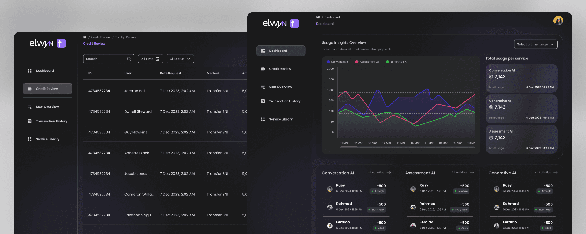
Dashboard Menu
The main page provides an overall summary of important data.
App Usage Statistics: Displays graphs and numbers that depict total active users, new users, and interactions with the app's key features.
Recent Activity: Contains the latest activity from users which can be viewed in real-time.
Credit Review
Credit Review
User Credit Listing: Displays a list of users with their credit status.
Credit Review and Adjustment: Easy to review user credit history and make adjustments according to application policies.
User Overview
User List: Provides a complete list of users with account details such as name, email, status, and access level.
User Statistics: Displays a graph of the number of users by specific category (for example, by country, engagement level, or account type).
User Management: Ability to add, deactivate, or delete user accounts.
Transaction History
Transaction History: Displays transactions that the user has made, complete with date, amount and status.
Filter & Search: Allows admins to search for transactions by date, user ID, or transaction status (e.g. success/failure).
Transaction Graph: A graph that displays monthly or yearly transaction trends to monitor usage growth.
Service Library
Service List: Provides a view of the list of services available in the application, with a brief description and active/inactive status.
Service Statistics: Shows service usage in a certain period, for example, how many users used each service.
Manage Services: Allows admin to add, edit or delete services available in the application.
Layout Structure
Sidebar
Top Navigation Bar
Dashboard Overview
Detail Section
Design Visual
Color: Color palette that matches the marketing team's branding guidelines.
Typography: Uses poppins font for easy reading on various screen sizes.
Iconography: Minimalist icons that clearly represent function. Icons for features such as credit, users, transactions, and services.
Graphs & Charts: Use of interactive graphs to visualize data such as credit usage, transactions, and service statistics.
Process
Results
Simple, functional, and efficient: This dashboard prioritizes easy access to important information.
Display data visually: Using graphs for transaction trends, credit usage, and user statistics makes data easier to understand.
Easy management: Admins can manage user credit, view transaction history, and manage services in one intuitive platform.
Update
This design is no longer used because there have been changes in terms of business and features

Lets Talk
©2022 Rahmad