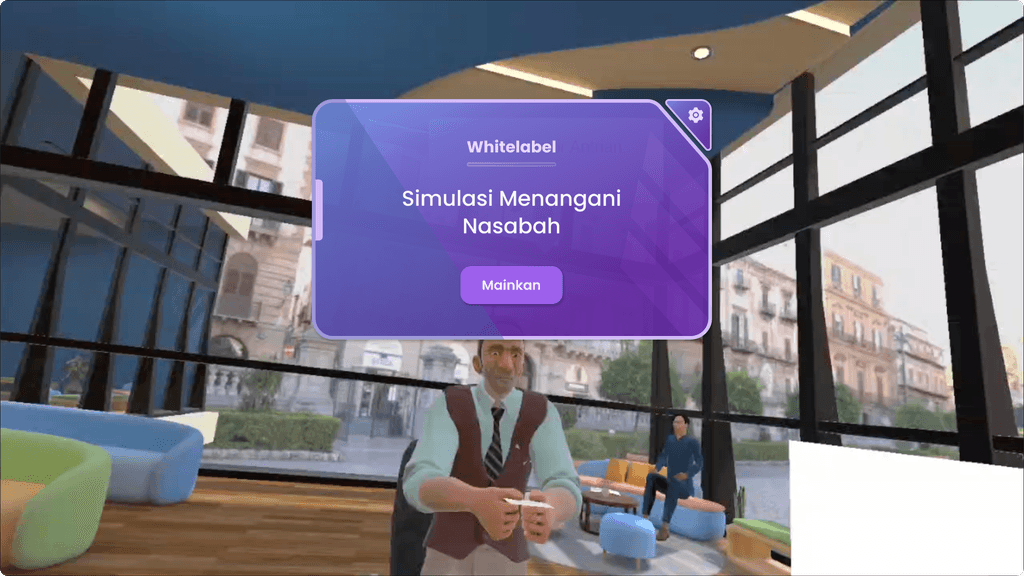
Whitelabel - Virtual Reality
Imagine a salesperson who has to convince a large banking company to adopt a new solution—without boring demos or monotonous presentation slides. We designed a whitelabel Virtual Reality (VR) simulation that allows sales teams to offer their clients an interactive banking experience—right from the meeting room. This project is a blend of creativity, user-centered design, and real business impact. Let's explore how we built it.
Team
Me : UI/UX Designer
Brian : Lead 3D Asset
Barkah : Implementor
Windy : Chief Operational Officer
Skills
User Research
Visual Design
Prototyping and Usability Testing
Duration
Juni 2024 - October 2024
Job Type
Project
Background
In the world of B2B sales, banking companies often face the challenge of differentiating themselves from competitors. Sales teams need tools that not only explain their services, but also make clients experience them. Traditional solutions like static mockups or promo videos are outdated—clients want something immersive and personal.
Challenges
Create flexible VR experiences (whitelabel) to be customized for various banking brands.
Ensure an intuitive interface for non-technical users (sales team and clients).
Balancing futuristic aesthetics with practical functionality.
I saw an opportunity to design a solution that would not only solve this problem, but also be a showcase of my abilities as a UI/UX Designer.
Design Process
Step 1: User Research
Saya memulai dengan mewawancarai tim sales dan mengamati presentasi mereka. Saya menemukan bahwa klien sering kehilangan minat setelah 5 menit karena kurangnya interaktivitas. Saya juga mempelajari kebutuhan klien perbankan: kepercayaan, kejelasan, dan pengalaman yang relevan dengan layanan mereka
Step 2: Ideation and Brainstorming
Virtual Lobby: A 3D banking space that can be customized (logo, colors, themes).
Interactive Modules: Simulations such as opening an account, applying for a loan, or checking an investment portfolio.
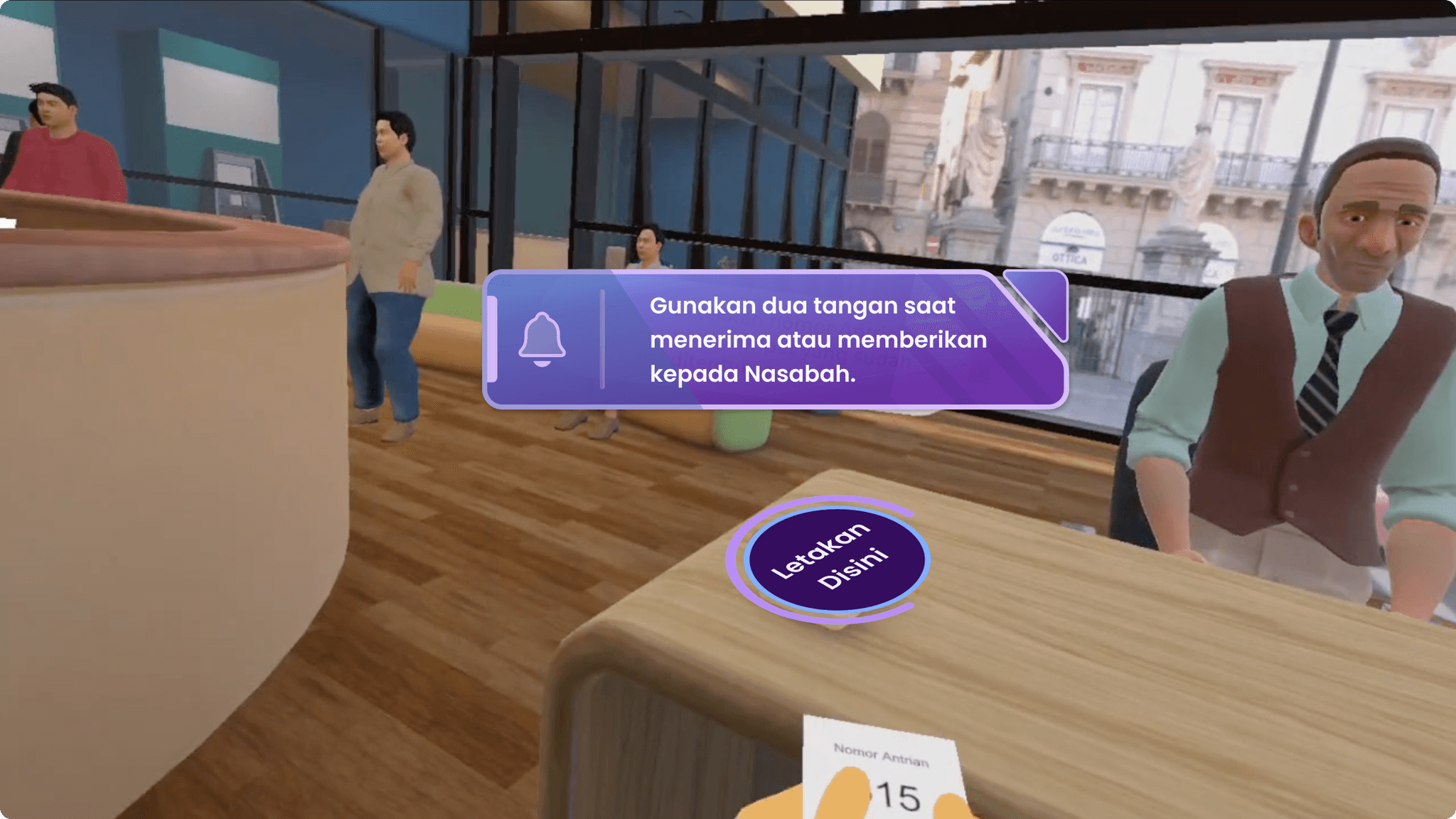
Gesture-Based Navigation: Uses hand gestures to navigate features, ensuring convenience for novice users.
Step 3: Wireframing
Create a wireframe that illustrates the basic structure and navigation of the virtual tour.
Use consistent and easy-to-use UI elements such as navigation buttons, popup info, and interactive icons.
Step 4: Prototyping and Testing
I build low-fidelity prototypes using tools like Figma, then test them with the sales team. Their feedback: “Cool, but too complicated.” I simplified navigation into three main gestures: point, swipe, grab.
Step 5: Finalization and Implementation
Futuristic visuals with soft gradients and subtle animations to reflect the modernity of banking.
Ambient audio (footstep sounds, light notifications) to increase immersion.
A whitelabel template that enables custom branding in minutes via a simple dashboard.
Design Process
Step 1: User Research
Saya memulai dengan mewawancarai tim sales dan mengamati presentasi mereka. Saya menemukan bahwa klien sering kehilangan minat setelah 5 menit karena kurangnya interaktivitas. Saya juga mempelajari kebutuhan klien perbankan: kepercayaan, kejelasan, dan pengalaman yang relevan dengan layanan mereka
Step 2: Ideation and Brainstorming
Virtual Lobby: A 3D banking space that can be customized (logo, colors, themes).
Interactive Modules: Simulations such as opening an account, applying for a loan, or checking an investment portfolio.
Gesture-Based Navigation: Uses hand gestures to navigate features, ensuring convenience for novice users.
Step 3: Wireframing
Create a wireframe that illustrates the basic structure and navigation of the virtual tour.
Use consistent and easy-to-use UI elements such as navigation buttons, popup info, and interactive icons.
Step 4: Prototyping and Testing
I build low-fidelity prototypes using tools like Figma, then test them with the sales team. Their feedback: “Cool, but too complicated.” I simplified navigation into three main gestures: point, swipe, grab.
Step 5: Finalization and Implementation
Futuristic visuals with soft gradients and subtle animations to reflect the modernity of banking.
Ambient audio (footstep sounds, light notifications) to increase immersion.
A whitelabel template that enables custom branding in minutes via a simple dashboard.
Impact for Sales & Clients
Hypothetical
Pitch to 5 banks: 4 showed interest for POC (Proof of Concept).
Branding setup time by sales: Less than 5 minutes.
Client bank feedback: 80% were impressed with the immersive experience compared to PowerPoint slides.
Design Metrics
First time user interaction success rate >95%.
Reflection and Learning
Success: White label flexibility and ease of use are the main attractions for sales.
Challenge: Simplifying VR interactions without losing the “wow factor.”
Learning: Design for sales requires a focus on efficiency and instant visual impact.
Reflection and Learning
Success: White label flexibility and ease of use are the main attractions for sales.
Challenge: Simplifying VR interactions without losing the “wow factor.”
Learning: Design for sales requires a focus on efficiency and instant visual impact.
Reflection and Learning
Success: White label flexibility and ease of use are the main attractions for sales.
Challenge: Simplifying VR interactions without losing the “wow factor.”
Learning: Design for sales requires a focus on efficiency and instant visual impact.
©2022 Rahmad